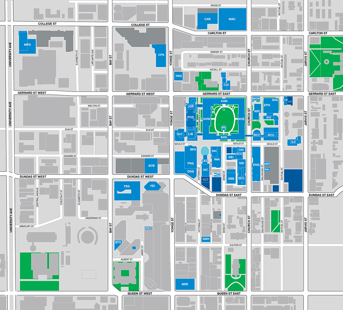
The TMU campus presents wayfinding challenges for students faculty, staff and visitors. Several distinct buildings share a common footprint and corridors, and there are pedestrian tunnels and bridges that link multiple buildings. Navigating interior spaces often means not knowing where one building ends and the next begins. Original suspended signage did not provide any information on the traveller's current location (building/floor) or note transitions between buildings.
Existing signage was based on the needs of departments operating in the spaces instead of the needs of the travellers trying to find them. Building on the existing signage standards, I developed a cognitive-design-based wayfinding strategy collaboratively with then-student, Evin Wong. Evin collected building data and then created critical, thoughtful and effective design elements. He then oversaw the implementation of suspended signage in seven interconnected buildings for a pilot.
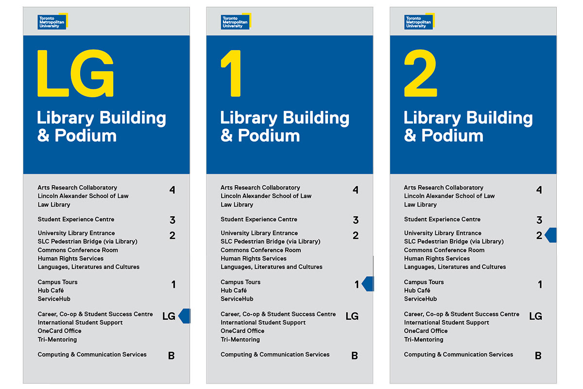
Design drawings of revised directory signage that corrects a design deficiency in the top panel and reorganizes the floor directory to be better aligned with user expectations.
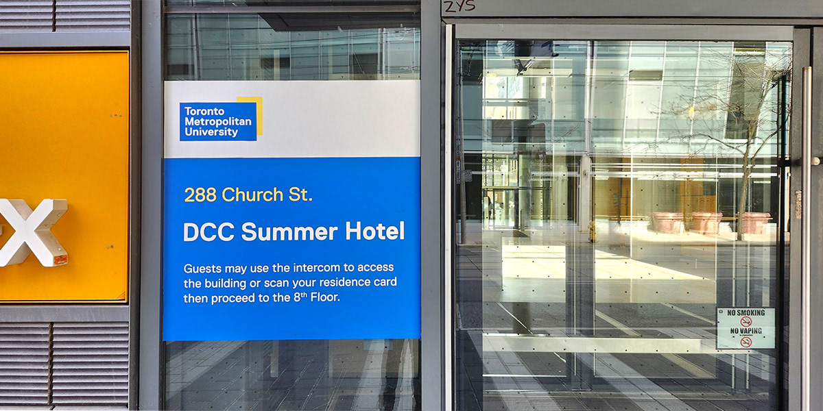
Design drawings of suspended wayfinding signage that shows the implementation of the wayfinding design strategy developed by Charmian Zoll and Evin Wong.
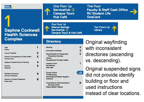
Design drawings showing some of the original wayfinding designs that illustrate some of the design deficiencies and challenges faced by travellers.
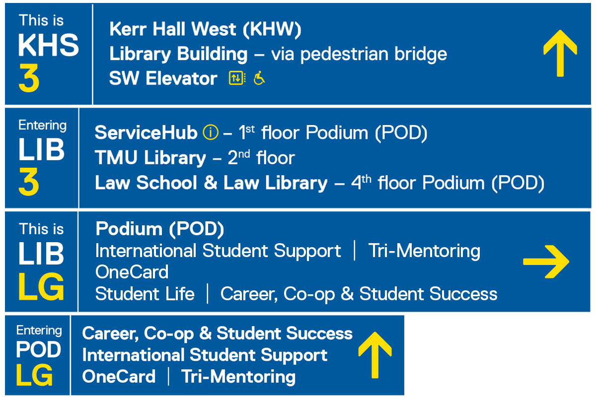
The shift in design approach prioritized a hierarchy of information for user-based needs: 1) "Where am I?", 2) "What's here?", and 3) "What are my next steps?" — location, context and options.
The second major shift was to develop a scheme based on human-psychology: Reducing the use of written instructions to combat the "doorway effect" (the psychological effect where you forget what you were thinking/planning when you move from one environment to another) and using salient cues that trigger automatic mental processes. Studies show an average of 200 milliseconds to capture attention when viewing signage — wayfinding signage is not read, it prompts action.
Simple, consistent and repetitive conventions reduce cognitive demands and mental resources. As people are moving, they use recognizable cues at key decision points and follow "breadcrumbs" to navigate.
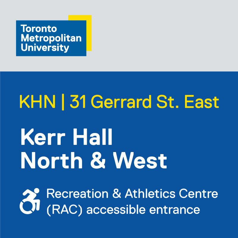
Photograph of an exterior building ID which includes additional information to direct people to an alternate accessible entrance.
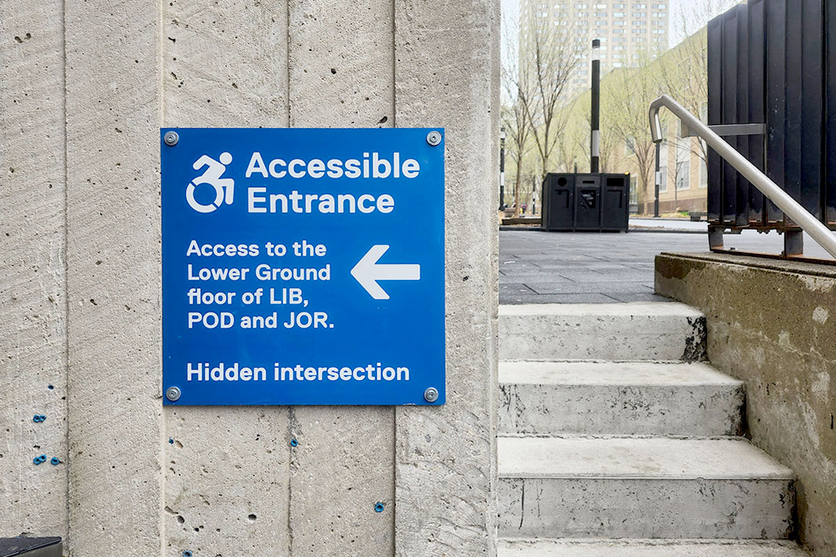
Photograph of an exterior sign that helps direct users to a hidden accessible entrance.
Design drawing of amended exterior signage that indicates the entrance is also used as an accessible entrance to an adjacent facility.
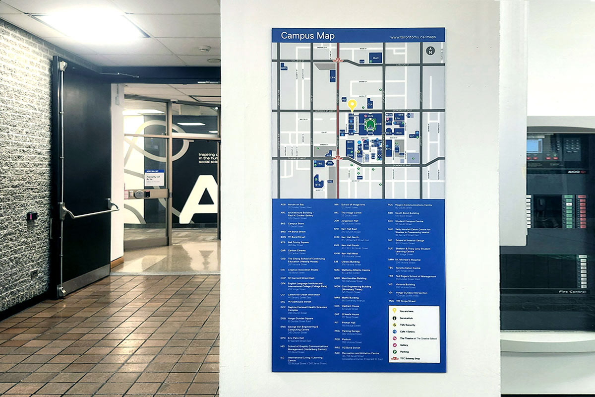
Photo of a redesigned interior campus map, which improves accessibility for map users.
Additionally, in support of out commitement to accessibility and inclusivity, we modified exterior building IDs for older buildings where the main entrance is not accessile to users of mobility devices. I modified the original building ID designs to include directions to the nearest accessible entrance. Additionally, original interior campus maps were 12" x 17" and were mounted too high to be legible for wheelchair users. I designed panels that were 17.5" x 35" and mounted at 53" a.f.f. on vertical centre. This lowered the enlargened text and graphics for more universal use.
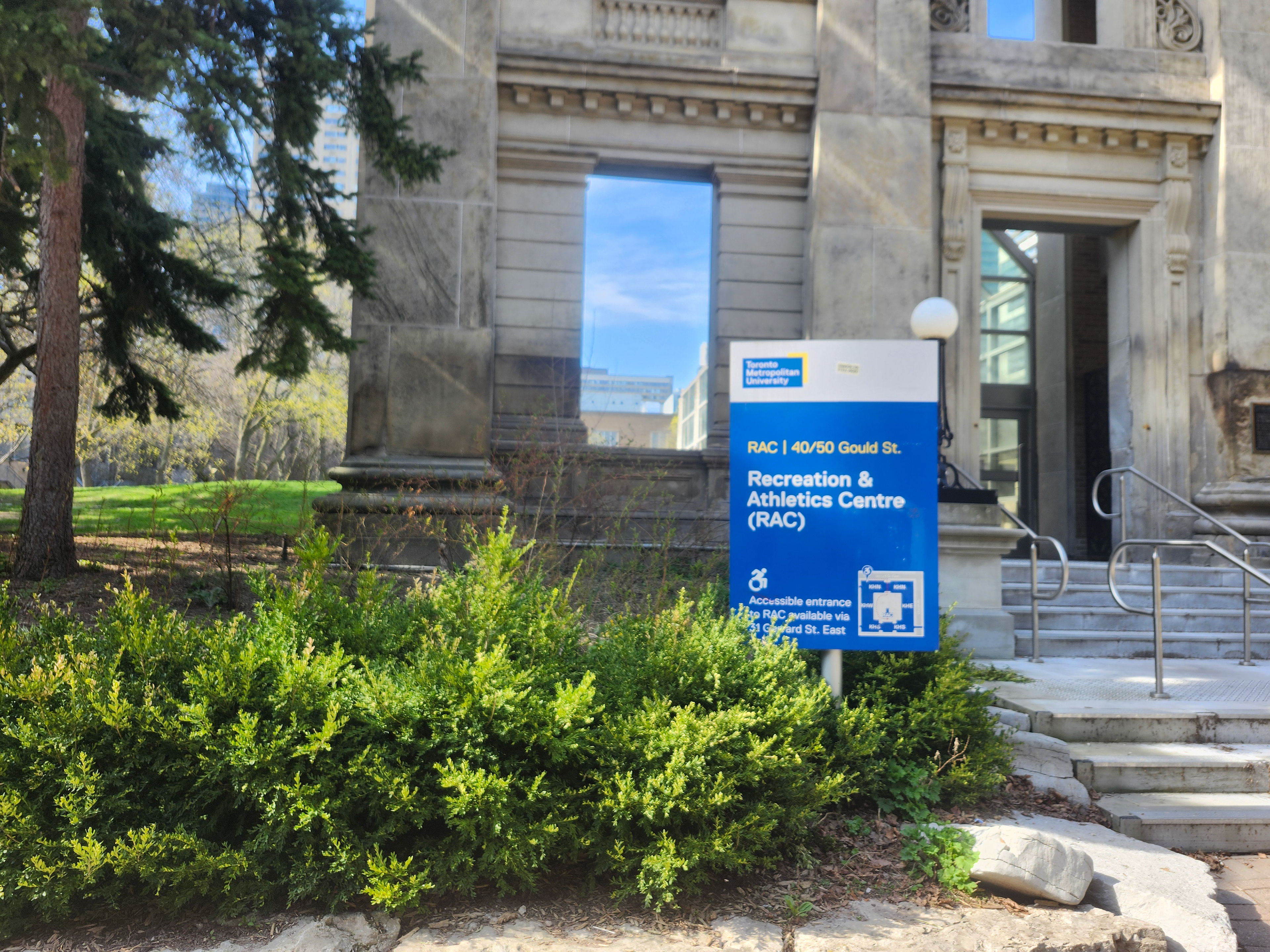
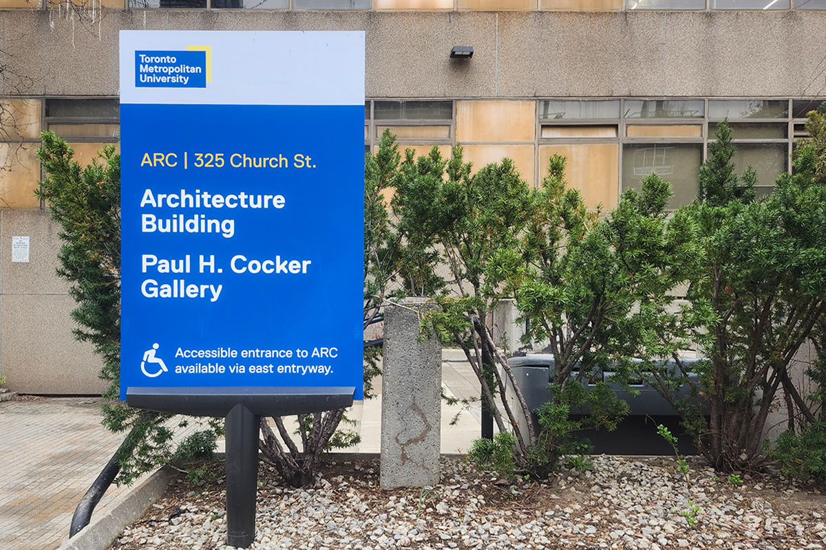
Photograph of an exterior building ID that provides additional directions to an alternate, accessible entrance.
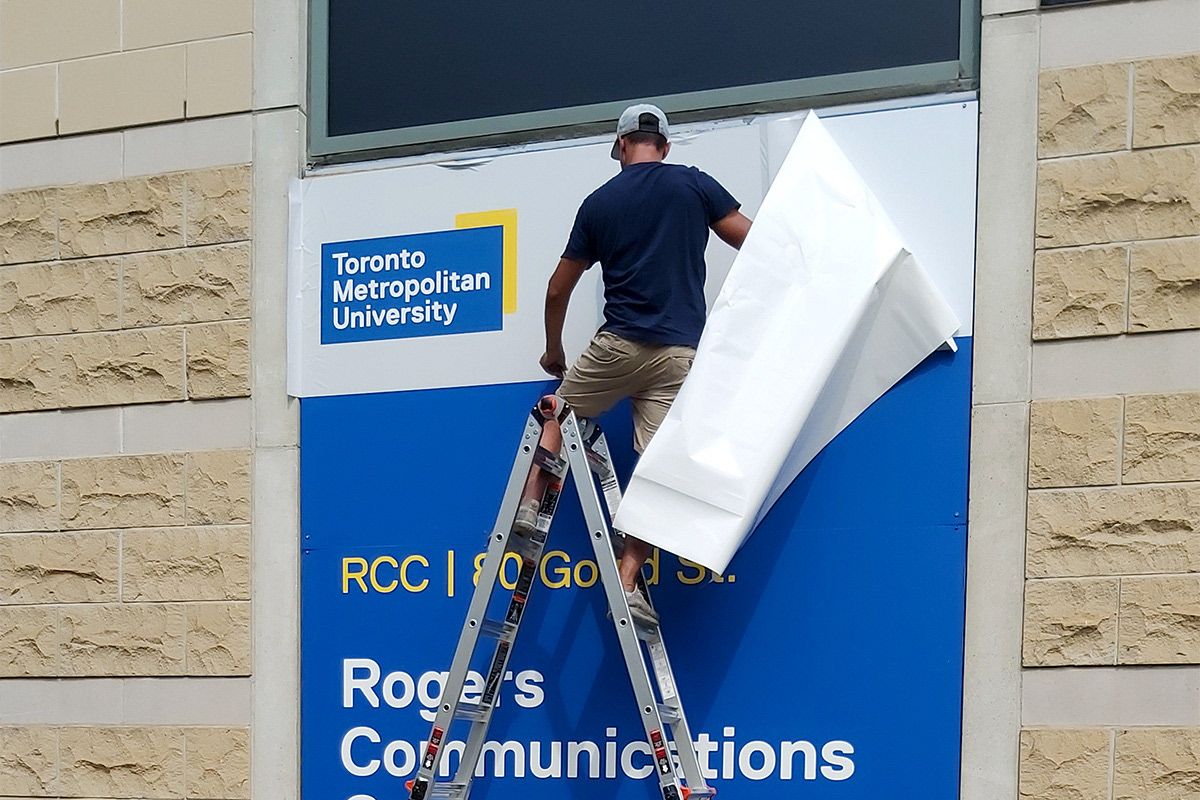
Photograph of a contractor installing a large window graphic.